
Replacing a convoluted static diagram
with a simple, easy to understand animation
My animation replaced a diagram that had been in active use across Khoros's sales and marketing materials. It was adopted companywide by the Khoros sales team, integrated into executive business reviews, adopted into sales decks, and used on the company’s website. It completely changed how the sales team communicated with customers resulting in a growth in sales.
THE IMPACT:
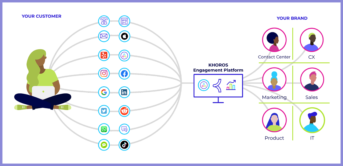
A potential customer looking at the old diagram describing Khoros’s B2B SaaS product is overwhelmed. Today you have seconds before you lose a viewer’s attention span, so that lack of clarity was costing Khoros conversations.
THE PROBLEM:
THE OLD DIAGRAM:
The old diagram is cluttered. As a static image it struggles to tell an inherently sequential story. Chaos doesn't become order in a frozen frame. The whole point of Khoros is that it transforms a fragmented, overwhelming situation into something unified and calm. That transformation is best communicated in motion.
A three second long animation with no narration replaces what previously required a couple minutes of guided explanation. Khoros’s value proposition is communicated swiftly and effectively.
THE SOLUTION:
Before opening any design software I sketched a storyboard and ran it by subject matter experts at Khoros to verify I was telling the right story and not just a visually satisfying one. Technical accuracy and emotional clarity are both required. If the story didn't land in rough sketches, it wouldn't land in polish.
THE PROCESS: STARTING WITH A STORYBOARD
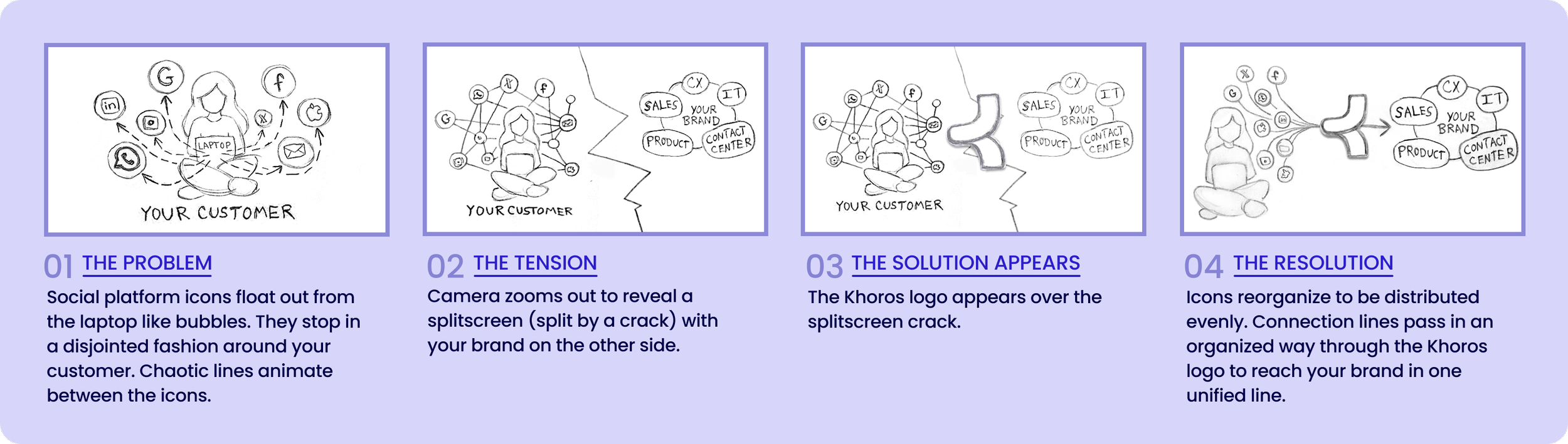
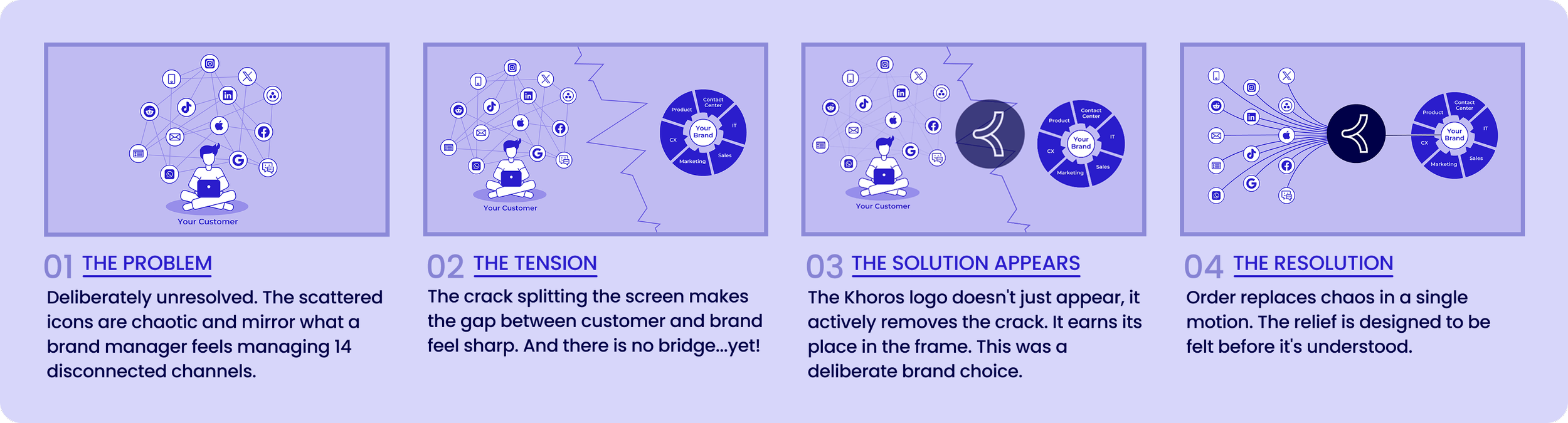
Each beat of the story is maintained through production.
My animation replaced the legacy diagram across Khoros’s sales and marketing materials. What previously required a long guided explanation could now be communicated in seconds without narration. It was adopted companywide by the Khoros sales team, integrated into executive business reviews, adopted into sales decks, and used on the company’s website. It completely changed how the sales team communicated with customers resulting in a growth in sales.
THE RESULT
OUTCOMES & REFLECTION
What I really learned here is "make this diagram easier to understand" is rarely the right brief. The actual brief was “make someone feel the problem before explaining the solution”. With this in mind, every decision from the motion, the split screen, to the logo as bridge followed naturally. Reframing the ask is often the most important design move.
In the fast paced world of B2B tech, explaining complex SaaS products can be a daunting challenge. But on-brand simplicity is easily achieved through animation. Complexity is demystified and a customer no longer needs to wade through dense documentation to understand what a solution offers.